The most mundane and absurd scene in American Psycho is at its 20-minute mark when the seniors of Pierce & Pierce show off their business cards; the pettiness of the exhibition reveals the triviality of their consumerist lifestyle and their comparable identity.
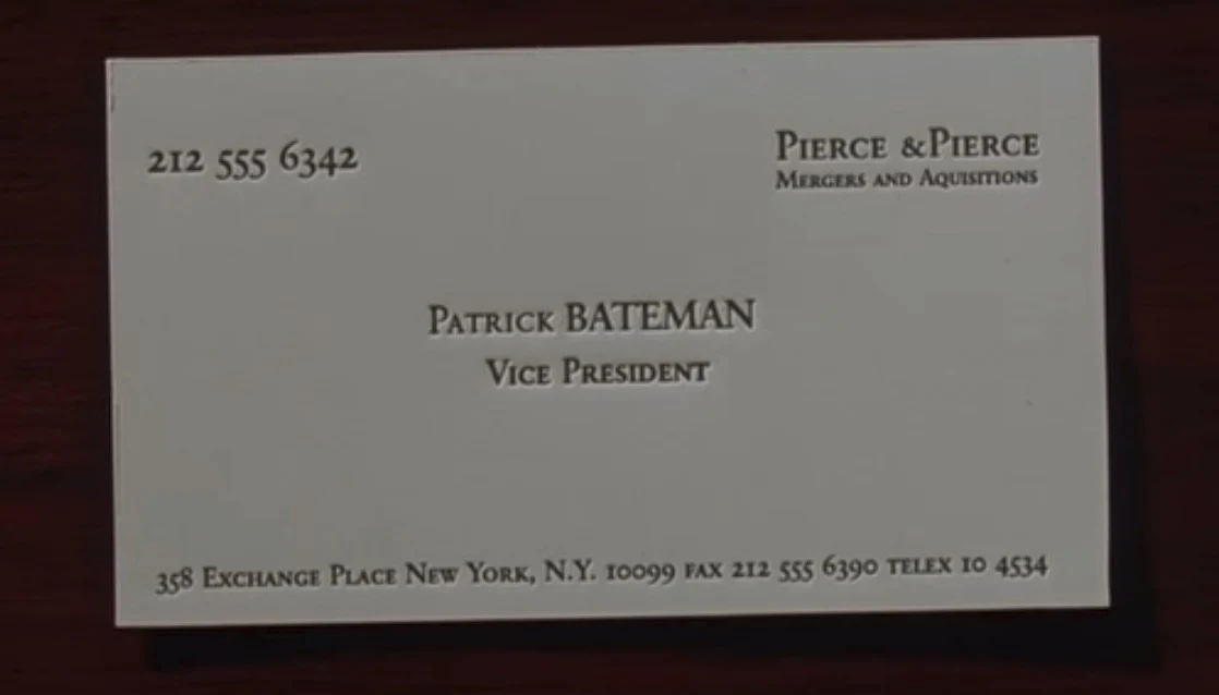
The business cards showdown was initiated by Patrick BATEMAN when he proudly took out his newly printed business card and slid it onto the table, fishing for compliments. According to him, the card’s color is “bone”—foreshadowing the bodies he’d later butcher, and the lettering is a fictional typeface called Silian Rail, although it’s actually Garamond Classico SC—a classic serif typeface. But here are some issues with his card: there’s no space between the “&” and “Pierce” in the company name, the “Acquisition” is misspelled (also true to the other cards), and the top margin is significantly wider than the rest which throws off the stability of the layout, reflecting its unhinged owner.
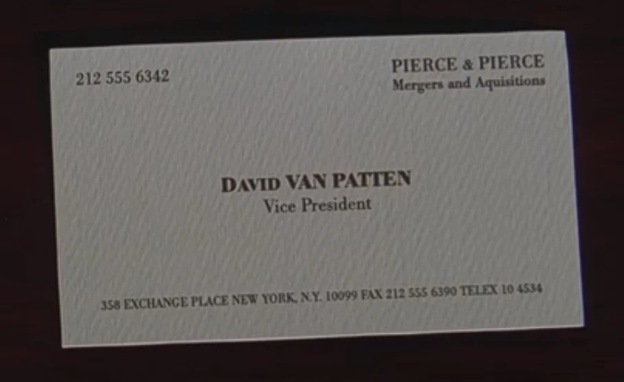
Next to him was David VAN PATTEN. “Eggshell with Romalian type,” he briefly described his card. Similarly, it used a serif typeface (Bodoni) that, compared to Bateman's, is more modern.
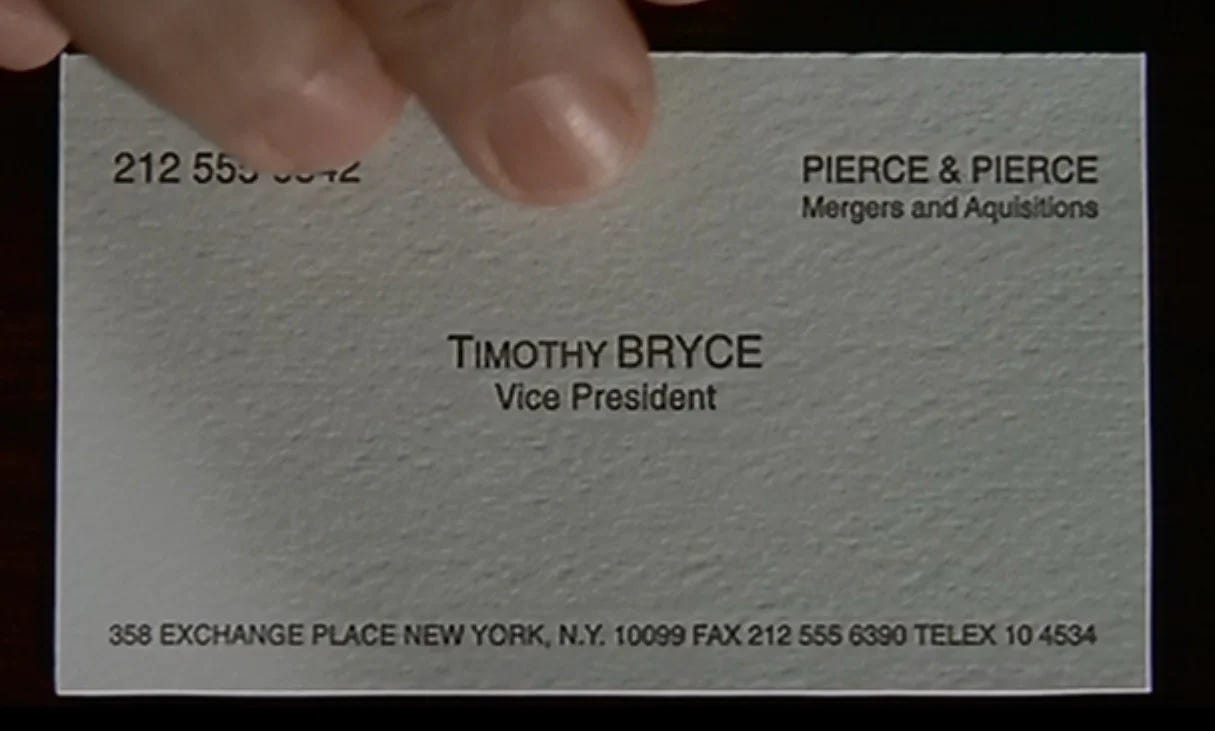
Then, came Timothy BRYCE. Like Patten’s, his is “pale nimbus white” with a subtler texture. He bragged that the lettering is “raised” (but clearly not. Nonetheless, his typeface is the most contemporary; it’s the widely used sans serif font called Helvetica. His card manifested the same margin problem with Bateman’s.
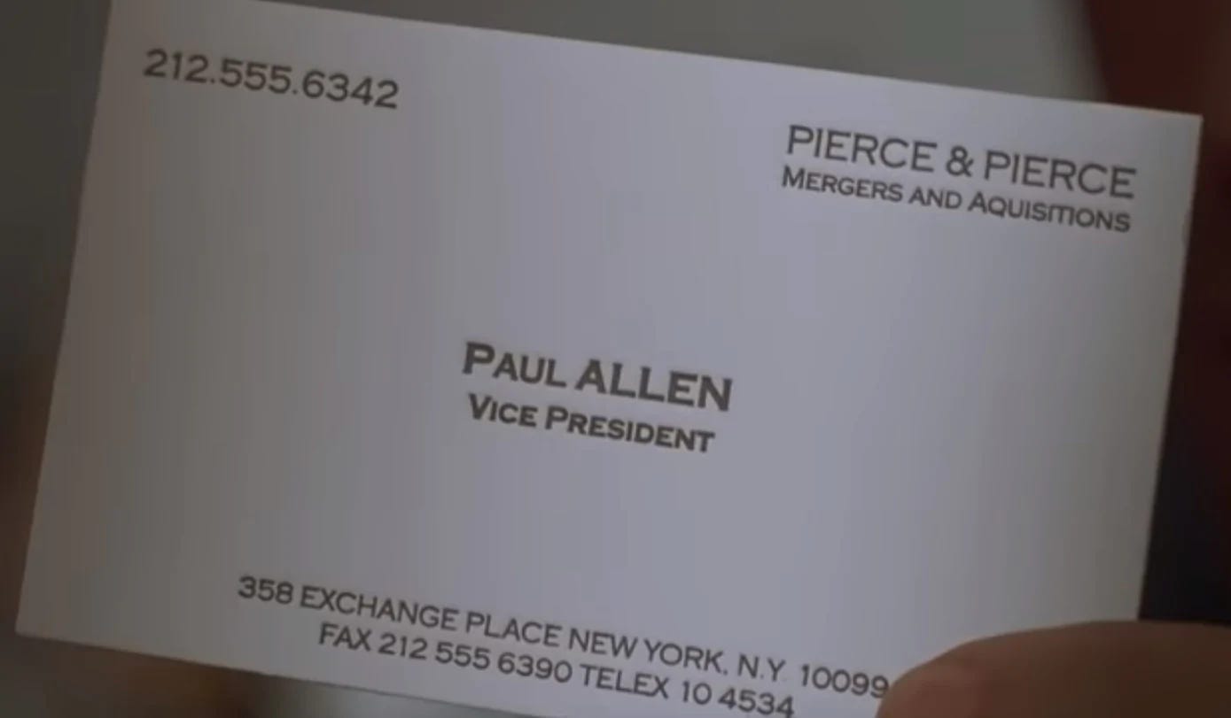
Lastly, the most awaited and intriguing was the “subtle off-white” card of the envied Paul ALLEN. His slightly stood out from the rest for obvious reasons: the contact number at the top is separated by a period instead of a space, the details at the footer are centered and set in two lines, and the weight of his name and position is noticeably thicker than the rest of the text. On top of these, one of the two more significant elements is the Copperplate Gothic typeface (also the movie title’s font). It’s a sans serif with distinctive, albeit subtle, glyphic serifs. These design choices reflect Allen’s coveted character. The other aspect utterly pointed out by Bateman was the card’s nonexistent watermark. This perceived “presence” of the absent watermark plays in context with Paul’s abstract “death”.
These nuances reflect the bourgeois ensemble. That is, the business cards are a tangible extension of the Wall Street yuppies wherein the evident identical cards convey their monotonous lifestyle and homogenous identity in a materialistic society. It works similarly to their expensive bland suits, their elusive dinings, and their lavish apartments.
Moreover, while the minimalist and straightforward design evokes luxury and confidence, the examined shortcomings (i.e. misspelling) suggest their innate flaws however hard they strive to reach perfection. Further, the variations (i.e. lettering, color) in design that set one apart merely indicate the characters’ individuality even though their materialistic tendencies often blur such thin demarcations of their interchangeable lives.
This three-minute scene succinctly shows the absurd, pretentious, and consumerist society where one’s identity and worth are tied to an object as trivial as a business card. If that’s not “psycho,” what is?


